"How I see it now" Blog Review
Organization and Layout
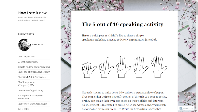
The size of font and line spacing are moderate, making the paragraph easy to read for audiences. I feel comfortable with the blogs when I scroll through the texts.
Additionally, there are some pictures in the blog. I can understand the blogger’s attempt at making texts pleasing to audiences. However, if I were the blogger, I would add photos of real interaction between my students and me, rather than virtual images. By this means, the blog could be more attractive and pragmatic for teacher audiences.
Content and Features
I have discovered a very interesting point that the blog is not filled with very technical issues. Instead, there is some interdisciplinary discussion and the blogger’s own experience sharing. For instance, the blogger focuses on a psychotherapy term and suggests teachers to employ this notion to help students explore personal life meaning in TESOL class. The blogger doesn’t seem to make audiences follow operating steps for high-tech teaching tools. In another blog, the blogger mentions a term called the honeymoon hangover effect and shares his own experience of decline in teaching career satisfaction.
Ease of use and Navigation
When I finish one blog reading, I have to scroll up to the top again in order to see the navigation column. I think this is inconvenient for audiences because the operation of scrolling up and down. If I were the blogger, I would choose to add brief introduction in the navigation column and make audiences get to know the main idea of each blog before reading in detail.
Target of Audience
The target audience is English teachers. The
blogger makes effort to share feeling and experience associated with teaching. She
decides to deliver the talk between teacher audiences and herself in a casual
and informal way. There are dozens of comments below the blogs. The blogger lists
the most popular blogs on the left side of webpages. From the comments from
teacher audiences, I could see some personal connection between the blogger and
them. Some audience may know the blogger personally and have considerable sympathy
with the blogger’s ideas and feelings. It such a harmonious online community that
the blogger commits herself to.
My recent blog reading list:
https://larryferlazzo.edublogs.org/
https://www.freetech4teachers.com/
https://eflnotes.wordpress.com/
There is a YouTube clip about blogging and you may find it usefull.
https://www.youtube.com/watch?v=YODPgBadj80


Hi Yangyang, it's great review of Hana's blog. The pictures you use help us know more details. I have some tips that you can use a more attractive title and create your own profile to let us know about you. By the way, I like your PINK background!
ReplyDelete